
Poster for September 2025: Featuring Happyend, The Baltimorons, Twinless, and others.
This month offers a little bit of everything, from the latest Paul Thomas Anderson film to the concluding chapter of Downton Abbey and Ed and Lorraine Warren’s final journey. With a few debuts from this week’s Toronto International Film Festival and last year’s edition, you’re sure to find something appealing.
That said, this diversity doesn’t guarantee quality, but the range of topics and genres is too broad to leave anyone uninterested. A quick look at the posters reveals something that might catch your eye. Is it Jordan Peele? Check. Is it Stephen King? Check. Even Kanye’s face will be a part of your local theaters, ensuring you won't mistakenly select In Whose Name? without realizing.
**Sea Creatures**
I’m a bit concerned about the goldfish featured on GrandSon’s poster for Splitsville (widely releasing on September 5). My worry isn’t about it just floating there next to the title; the angle shows it’s healthy and swimming up, searching for food rather than gasping for air. No, my concern stems from the humans depicted beneath it looking quite battered.
Seeing that only the men appear bruised intensifies my worry, especially since a quick Google search implies that the fish is likely male too. Perhaps that’s why it’s hastily leaving while it still has the chance.
Aside from this detail, the poster itself is quite straightforward. It has an off-white background with a thick frame matching the title color for balance. While it may lack creative structure, it compensates with intrigue, beginning with the tagline “An unromantic comedy.”
This image of couples starts resembling a Fleetwood Mac album cover, hinting at multiple simultaneous love triangles. The positioning of the arms, the longing stares, and the bloodstains all contribute to this impression. If the ongoing marketing includes more materials, we might even see a few dismembered limbs by the end.
Sleep with Your Eyes Open (limited release on September 5) is also quite simple—just a film image overlaid with text—yet the composition and movement are commendable.
The way the photo is cropped allows the actor’s body to create an ideal diagonal line from the top left to the bottom right, while the fish provides a diagonal pathway leading to his hand. It’s natural for our eyes to follow this implied route, with the title placed along it for a rhythmic journey from one word to the next.
Though the title appears in three different languages, it does get a bit cluttered. However, I appreciate how they’re justified. The middle sections are centered while the bookends are pushed to the edges, as if they’re brackets enclosing these words as a single unit.
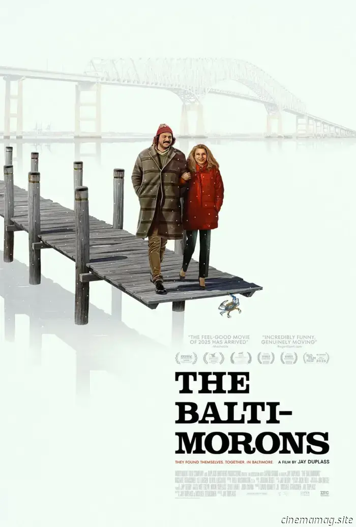
MOCEAN’s design for The Baltimorons (limited, September 5) also employs a diagonal layout, depicting a long dock that suggests a destination for the characters. Are they about to plunge into the water? Possibly. But the collective experience holds significance. This embodies the film’s core message: to take that leap of faith you’ve been avoiding. If it doesn’t turn out well, at least you made the effort.
Their trajectory leading us to the title demonstrates effective design. The crab hanging off the edge pauses our gaze just long enough for us to avoid getting wet. We then gradually shift our focus to the laurels and carefully read through each line of text until reaching the end.
Is the hyphen unnecessary? Certainly. Does it serve as a nice touch to emphasize the title’s humor? Absolutely.
**Marauding at Midnight**
It’s always exciting when an artist has multiple releases in the same month, allowing me to dedicate an entire section to them. This September, we have Midnight Marauder.
First up is the atmospheric Plainclothes (limited, September 19). The textured black adds a gritty feel: the image of Tom Blyth—alongside a presumably shadowy Russell Tovey—almost seems illuminated by a cool light. They appear as ethereal figures gliding along the right side of the page above a vibrant rainbow of colors below.
This positioning lets the text shift left as a counterbalance, creating two distinct pieces that harmonize into one. Adding subtle digital distortion to some letters in the actors' names and the title reinforces the idea of ghosts within the machine. The poster feels alive, evoking a sense of memory rather than a mere photograph.
Next is Rabbit Trap (limited, September 2). There’s a hint of distortion here, but this time it isn’t digital. It appears temporal: Dev Patel’s image overlaps itself as if a second version is emerging from the first. This captivating visual is enhanced by the headphones and the story about uncovering an enchanting sound that distances the listener from reality—your mind instinctively wants to heighten the sensory experience, despite our eyes being unable to hear.
Yet, you do “hear” something, don’t you? The visual transition, along with the springy coil wave depicted


Other articles
 The latest and largest update for World of Tanks is now available and comes with treats for all tank commanders.
Update 2.0 for World of Tanks is now live, introducing 6 new Tier XI tanks, an overhauled Hangar and user interface, a narrative-driven PvE mode, and much more. In addition to a Hangar filled with fresh content, this update, the largest and most ambitious to date, will also reward tank commanders with epic gifts just for logging in.
The latest and largest update for World of Tanks is now available and comes with treats for all tank commanders.
Update 2.0 for World of Tanks is now live, introducing 6 new Tier XI tanks, an overhauled Hangar and user interface, a narrative-driven PvE mode, and much more. In addition to a Hangar filled with fresh content, this update, the largest and most ambitious to date, will also reward tank commanders with epic gifts just for logging in.
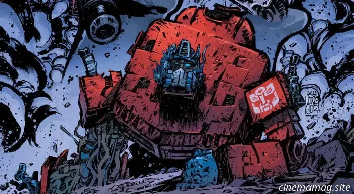 Optimus Prime and Megatron clash in the preview for Transformers #24.
Image Comics and Skybound Entertainment are set to release the highly anticipated Transformers #24 next week, marking writer Daniel Warren Johnson's departure from the Energon Universe reboot. You can take a look at the issue as the arch-enemies Optimus Prime and Megatron confront each other once again... This is the moment. The new era of TRANSFORMERS is about to begin with [...]
Optimus Prime and Megatron clash in the preview for Transformers #24.
Image Comics and Skybound Entertainment are set to release the highly anticipated Transformers #24 next week, marking writer Daniel Warren Johnson's departure from the Energon Universe reboot. You can take a look at the issue as the arch-enemies Optimus Prime and Megatron confront each other once again... This is the moment. The new era of TRANSFORMERS is about to begin with [...]
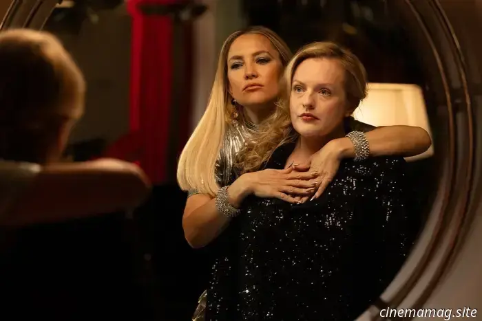 Trailer for the wellness horror-comedy "Shell," featuring Elisabeth Moss and Kate Hudson.
Paramount has released a trailer and images for Shell, the forthcoming dark comedy horror-thriller directed by Max Minghella (Teen Spirit). Featuring elements reminiscent of The Substance, Elisabeth Moss portrays Samantha, a struggling actress seeking to revive her previously successful career, who gets entangled in the glamorous life of Zoe (Kate [...]
Trailer for the wellness horror-comedy "Shell," featuring Elisabeth Moss and Kate Hudson.
Paramount has released a trailer and images for Shell, the forthcoming dark comedy horror-thriller directed by Max Minghella (Teen Spirit). Featuring elements reminiscent of The Substance, Elisabeth Moss portrays Samantha, a struggling actress seeking to revive her previously successful career, who gets entangled in the glamorous life of Zoe (Kate [...]
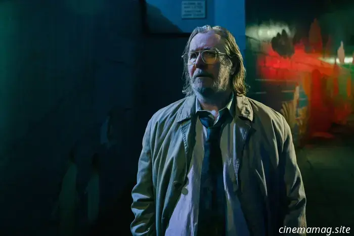 Apple TV+ has released the trailer for season 5 of Slow Horses.
With less than three weeks remaining until the return of Slow Horses, Apple TV+ has released a trailer for the fifth season of the highly regarded espionage drama, which is inspired by the novel London Rules from Mick Herron’s acclaimed “Slough House” series. The cast features Gary Oldman, Kristin Scott Thomas, Jack Lowden, Saskia Reeves, Rosalind […]
Apple TV+ has released the trailer for season 5 of Slow Horses.
With less than three weeks remaining until the return of Slow Horses, Apple TV+ has released a trailer for the fifth season of the highly regarded espionage drama, which is inspired by the novel London Rules from Mick Herron’s acclaimed “Slough House” series. The cast features Gary Oldman, Kristin Scott Thomas, Jack Lowden, Saskia Reeves, Rosalind […]
 Venice Review: Amanda Seyfried Delivers Her Best Performance in Mona Fastvold’s The Testament of Ann Lee.
In The Testament of Ann Lee, Amanda Seyfried delivers the best performance of her career. The actress trembles, resonates, and wails through a range of 18th-century hymns reimagined by Daniel Blumberg, the composer who voiced his appreciation for London's Cafe Oto (another hub of unusual sounds) following his unexpected yet well-deserved Oscar win.
Venice Review: Amanda Seyfried Delivers Her Best Performance in Mona Fastvold’s The Testament of Ann Lee.
In The Testament of Ann Lee, Amanda Seyfried delivers the best performance of her career. The actress trembles, resonates, and wails through a range of 18th-century hymns reimagined by Daniel Blumberg, the composer who voiced his appreciation for London's Cafe Oto (another hub of unusual sounds) following his unexpected yet well-deserved Oscar win.
 LEGO reveals its Seasonal Sets for Christmas 2025.
The LEGO Group has officially presented three new seasonal products for Christmas 2025: the Snowman Ornaments, the Festive Gingerbread House, and the Up-Scaled Santa Minifigure sets. All these items will be available for purchase starting October 1st. Take a look at the promotional images and information below… Let it snow, let it snow, let it snow! Make wishes of a […]
LEGO reveals its Seasonal Sets for Christmas 2025.
The LEGO Group has officially presented three new seasonal products for Christmas 2025: the Snowman Ornaments, the Festive Gingerbread House, and the Up-Scaled Santa Minifigure sets. All these items will be available for purchase starting October 1st. Take a look at the promotional images and information below… Let it snow, let it snow, let it snow! Make wishes of a […]
Poster for September 2025: Featuring Happyend, The Baltimorons, Twinless, and others.
This month has a variety of offerings, including the latest from Paul Thomas Anderson, a concluding chapter of Downton Abbey, and the final adventure of Ed and Lorraine Warren. With a few debuts coming straight from this week's Toronto International Film Festival, as well as selections from last year, you're sure to discover something appealing.