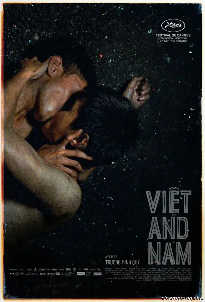
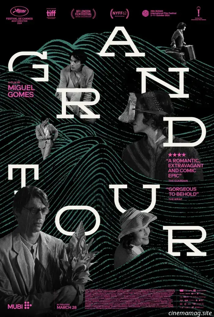
Posterized March 2025: Grand Tour, Eephus, Misericordia, and Additional Highlights
The Oscars have concluded, and the nominees and winners are expected to attract interest in both theaters and at home. Viewership saw a slight increase compared to last year, suggesting that many may not have been aware of these films until now. This leaves less time for audiences to explore new releases, and studios seem to recognize this, as only Snow White (March 21) and Novocaine (March 14) are positioned as major mainstream releases, unless Warner Bros. has surprises in store.
This scenario presents both opportunities and challenges for the independent and foreign films mentioned below. While competition from Hollywood may be reduced, potential ticket buyers may also be fewer. Thus, effective poster marketing becomes vital for drawing interest and converting undecided viewers seeking something new.
This time of year also brings a fresh wave of Oscar-themed designs from poster creators showcasing their artistic talents. The landscape has shifted from alternative posters; many familiar designers are now producing official one-sheets. This evolution has been exciting to observe. Here are my favorite four pieces from 2025, along with links to each artist's collection:
Credits: Conclave by Matt Needle; Nickel Boys by Haley Turnbull; The Brutalist by Pablo Iranzo Duque; I’m Still Here by Eileen Steinbach.
Superimposition
The design is both simplistic and unsettling. Is it a still from the film or an artistic representation of its themes? Bruce LaBruce's The Visitor (limited, March 7) features an unidentified refugee charming every member of an affluent family before vanishing, leaving them in turmoil. Perhaps we'll uncover that he has vagina-like openings on the soles of his feet, or maybe the victims’ longing results in them surrealistically developing new orifices to be filled.
Regardless, it’s a striking image. It's likely not decor for your local multiplex due to its graphic content, regardless of whether children comprehend it. The Internet age allows for provocative marketing campaigns online, enabling viewers to share it themselves.
Charlie Hyman's illustration for The Heirloom (limited, March 21) is less controversial than The Visitor but remains intriguing enough to captivate an audience's attention. What is occurring here? The couple's heads intertwine via their hair, somehow merging into the body of a dog. The cuff around the dog’s neck transforms those faces into a coat, shifting from absurdity to metaphor, representing a traumatized rescue dog that relies on its owners for security.
I’m uncertain about the purpose of the baggie in the bottom right, but I can make some assumptions—I’ve had to fetch after a dog myself. The real puzzler here is its color. Why is it yellow like the faces and title? Could it have human origins? Is it indicative of the dog’s relationship with its new owners, perhaps symbolizing harm over help?
I could elaborate endlessly on the image's interpretations, which is the point. A photograph of actors cannot evoke the same depth of curiosity and personal meaning as a unique piece that builds intrigue through artistic interpretation. It seems Hyman watched the film, making intentional choices. More than just an advertisement, this poster becomes a riddle to decode.
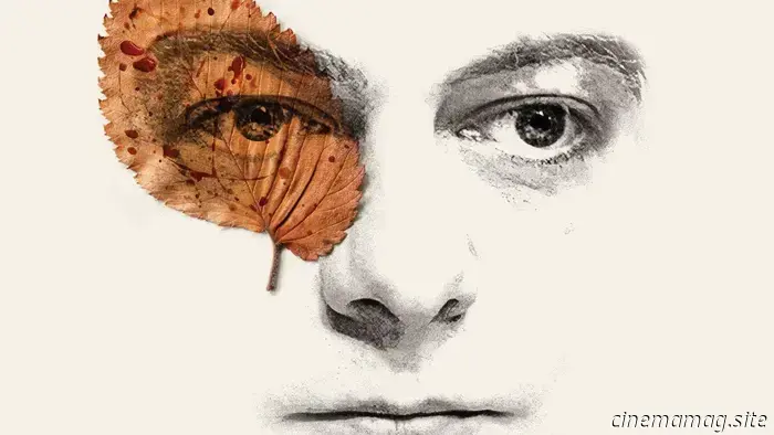
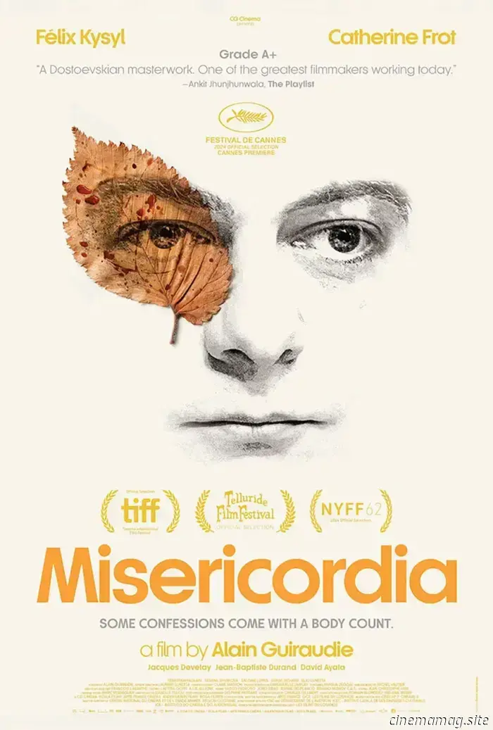
Maks Bereski’s Misericordia (limited, March 21) may be less eccentric yet remains fascinating in its connection of humanity and nature. It's another puzzle in understanding who this man is and what the (blood-splattered) leaf signifies, but (unlike The Heirloom) it doesn't provide clear cues for understanding the underlying psychology.
Reading the synopsis does little to clarify, revealing only a murder connected to that blood. Instead, it leads to more confusion: the minimalist design makes it even more enigmatic by not overtly referencing those events.
We need to appreciate it for what it conveys at face value: its balance and symmetry. The playful sans serif juxtaposes with strict typography. The shapes emerging from the color palette guide our eyes down the page in a large “I” pattern, maintaining focus on this face juxtaposed with the harshness of man's nature.
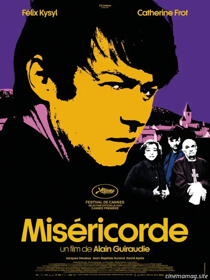
This approach starkly contrasts with Misericordia's heavily filtered French counterpart. Using the same font and rigid typography, the color scheme becomes more oppressive due to the absence of white. The interplay between warm and cool tones creates a sense of division in importance and morality. After all, "mercy" is the essence of its title. But for whom? The murderer or the victim?
Pairs
I can’t shake a feeling of unease when considering the French poster for Who by Fire (limited, March 14). It features little more than two people sitting closely, their arms and legs touching, yet it feels like a calm before an impending storm. Will their hands meet? Is there a mutual longing? Is it a power dynamic where trust is on the verge of collapse?
By cropping their faces out of the frame, we are left without expressions to aid in deciphering intent. Perhaps they are oblivious to their closeness. Or maybe he
Other articles
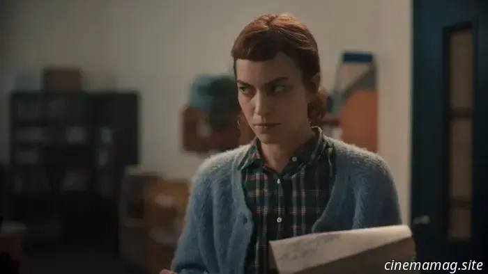 Trailer for the thriller Darkest Miriam featuring Britt Lower from Severance.
Game Theory Films has unveiled a trailer for Darkest Miriam, an adaptation of Martha Baillie’s novel The Incident Report by writer-director Naomi Jaye. The thriller features Britt Lower from Severance as Miriam, a librarian whose previously sheltered life is disrupted when she starts receiving a string of threatening letters while embarking on a new relationship. Joining […]
Trailer for the thriller Darkest Miriam featuring Britt Lower from Severance.
Game Theory Films has unveiled a trailer for Darkest Miriam, an adaptation of Martha Baillie’s novel The Incident Report by writer-director Naomi Jaye. The thriller features Britt Lower from Severance as Miriam, a librarian whose previously sheltered life is disrupted when she starts receiving a string of threatening letters while embarking on a new relationship. Joining […]
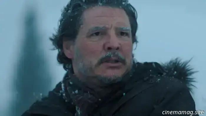 The new trailer for season 2 of The Last of Us has been released by Max.
With just over a month remaining before the much-anticipated second season of The Last of Us premieres, Max has unveiled a new trailer for the celebrated video game adaptation. This season takes place five years after the conclusion of the first, as Joel and Ellie confront their past, leading to conflict […]
The new trailer for season 2 of The Last of Us has been released by Max.
With just over a month remaining before the much-anticipated second season of The Last of Us premieres, Max has unveiled a new trailer for the celebrated video game adaptation. This season takes place five years after the conclusion of the first, as Joel and Ellie confront their past, leading to conflict […]
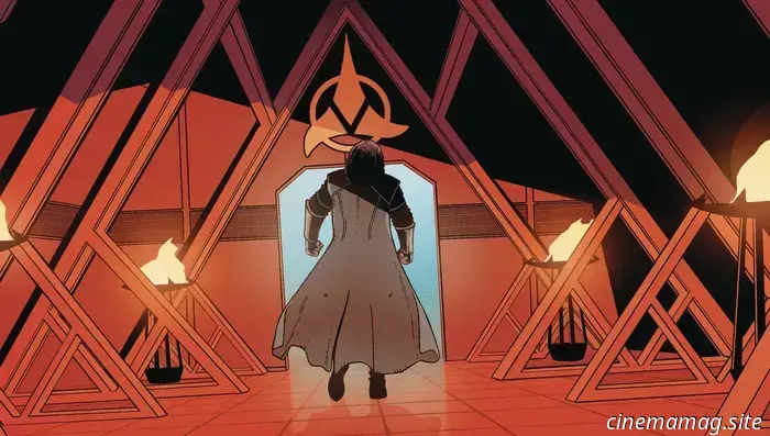 Star Trek #30 - Comic Book Sneak Peek
Star Trek #30 will be available in comic shops and digital platforms this Wednesday, and you can check out a preview of the issue below, courtesy of IDW Publishing. Following the Day of Blood, Kahless II finds himself a defeated and broken individual with only one way forward: to confront himself. Thrown back in […]
Star Trek #30 - Comic Book Sneak Peek
Star Trek #30 will be available in comic shops and digital platforms this Wednesday, and you can check out a preview of the issue below, courtesy of IDW Publishing. Following the Day of Blood, Kahless II finds himself a defeated and broken individual with only one way forward: to confront himself. Thrown back in […]
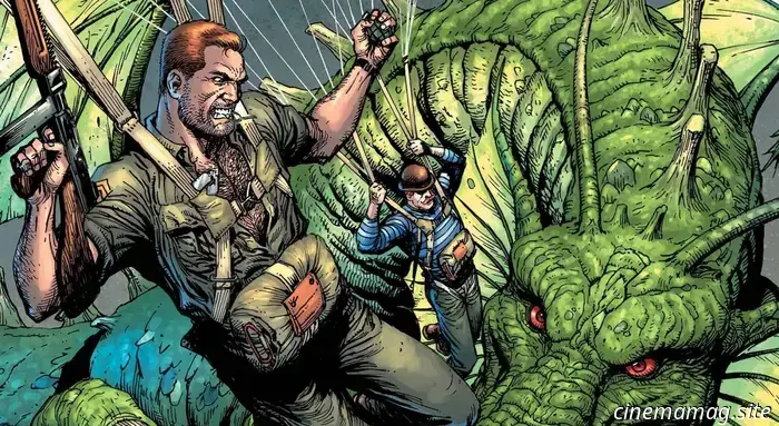 Comic Book Sneak Peek - Nick Fury vs. Fing Fang Foom #1
Marvel Comics will be releasing Nick Fury Vs. Fing Fang Foom #1 this Wednesday, and you can check out the official preview of the one-shot comic by J. Michael Straczynski below… THE HOWLING COMMANDOS GO UP AGAINST FIN FANG FOOM! NICK FURY is adept at dealing with issues of any scale – but he’s never encountered […]
Comic Book Sneak Peek - Nick Fury vs. Fing Fang Foom #1
Marvel Comics will be releasing Nick Fury Vs. Fing Fang Foom #1 this Wednesday, and you can check out the official preview of the one-shot comic by J. Michael Straczynski below… THE HOWLING COMMANDOS GO UP AGAINST FIN FANG FOOM! NICK FURY is adept at dealing with issues of any scale – but he’s never encountered […]
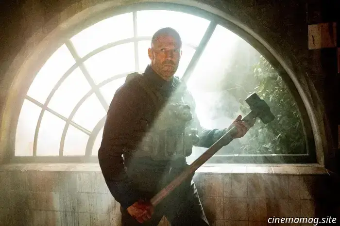 New featurette released for the Jason Statham action-thriller A Working Man.
Amazon MGM Studios has released a featurette for the action thriller A Working Man, where director Ayer talks about reuniting with Jason Statham, the star of The Beekeeper. The featurette also features interviews with co-stars David Harbour, Michael Peña, and Arianna Rivas. You can watch it below… Levon Cade has stepped away from a distinguished military career [...]
New featurette released for the Jason Statham action-thriller A Working Man.
Amazon MGM Studios has released a featurette for the action thriller A Working Man, where director Ayer talks about reuniting with Jason Statham, the star of The Beekeeper. The featurette also features interviews with co-stars David Harbour, Michael Peña, and Arianna Rivas. You can watch it below… Levon Cade has stepped away from a distinguished military career [...]
Posterized March 2025: Grand Tour, Eephus, Misericordia, and Additional Highlights
The Oscars are over, and both the nominees and winners are likely to attract attention in cinemas and at home––viewership increased slightly compared to last year, suggesting that many people were not familiar with the films until now. This leaves limited time for attracting audiences to new releases, and it appears that studios are taking this into account.