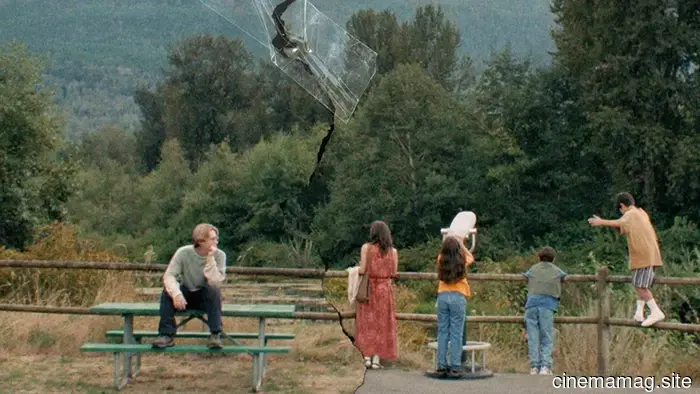
Posterized April 2026: Blue Heron, The Christophers, Exit 8, and More
Is spring becoming the new summer? It certainly looks like a momentous month for movies.
Mario. Michael Jackson. Pattinson/Zendaya 1.0. Universal's recurring theme presenting yet another rendition of The Mummy. Even Faces of Death (April 10) holds some enticing relevance for a new audience that may have caught whispers of urban legends from their parents. (I almost used “grandparents,” but I’m not that old yet, and it was still a topic during my youth.)
Considering the success of these campaigns (including the latter’s playful, frosted NSFW teaser campaign, which I hope some daring theaters used to cover their lobbies), film studios had their work cut out for them in grabbing attention.
As you'll see below, they effectively achieved that goal with some outstanding poster designs.
Faces
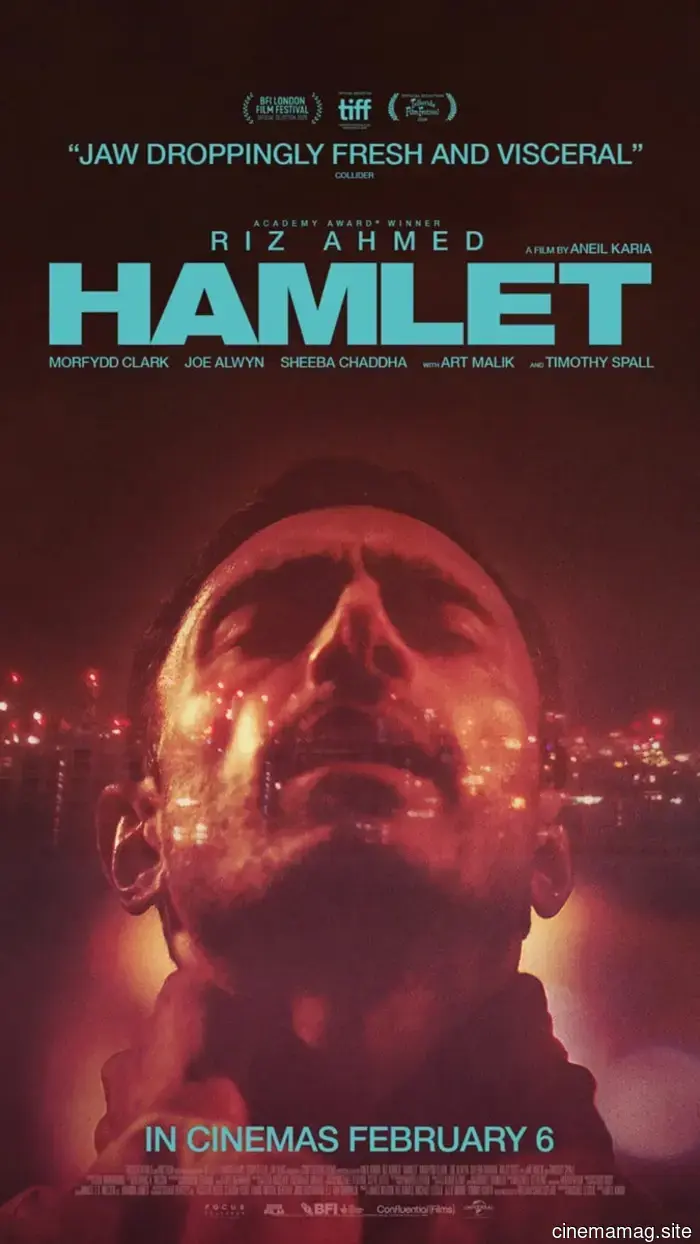
The Refinery presents a straightforward yet impactful one-sheet for the newest adaptation of Hamlet (limited, April 10), featuring Riz Ahmed. The international poster incorporates a beautiful cityscape translucency to reflect the film’s iconic “To be or not to be” highway scene, while the American version emphasizes that this isn’t your parents' Shakespeare. The creative team intentionally embraced their star's rap background to give the dialogue an edgy, lyrical quality that reinterprets the play through a modern perspective.
We see Ahmed in a glamorous profile shot adorned with a massive crown graffitied on his head, giving it a street art vibe. It’s not exactly Basquiat, but the film highlights the clash between counterculture and wealth, as the kingdom in question is a corporation, not a nation. This image feels reminiscent of Netflix’s “Luke Cage,” especially with Cottonmouth's Biggie photo on the wall. It captures the conflict between how others perceive you and how you view yourself.
There’s also a music/cinema blend with Erupcja (limited, April 17). While it stars Charli XCX, the poster evokes a DIY concert flyer with its two-tone visuals. It showcases a rockstar pose featuring two women enjoying the moment: one soaking in the atmosphere while the other confidently gazes at us, the orange hue creating an almost infrared effect.
The piece that ties everything together is the title text. While everything else is neatly organized in blocks at the bottom, the title is large and angled along the line connecting the women’s heads, with letters so closely spaced they overlap. The bold white catches our attention, and the angle suggests movement. The pronunciation guide reassures us that the title is precisely what we assume—just in a different language.
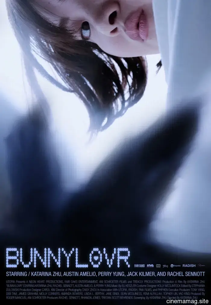
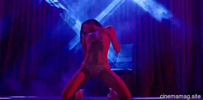
My favorite “portrait” of the month belongs to Bunnylovr (limited, April 10) with its striking angle from below of Katarina Zhu’s camgirl. The cropping presents her face dropping from the frame's top. The gaze from her one visible eye invites us in. The blurred foreground shadow of bunny ears beautifully frames her cascading curls. What a remarkable shot.
When an image is that captivating, the goal is to avoid detracting from it. Consequently, all text is pushed to the bottom. Credit block. Cast highlights. Logos. Title (with a heart for a cheeky touch). Distracting from the photo must be avoided—especially since it's crafted to lead our eyes downward. Capture our attention first, then satisfy our curiosity with the information we suddenly need.
Echoes
Promoted as a “reimagining of the lost Lon Chaney classic,” A Blind Bargain (limited, April 24) features a poster that aligns with a retro aesthetic. The artist could have even further embraced a vintage feel reminiscent of scissors-and-glue graphic design from before the Photoshop era. This is suggested by the crisp outline around Glover’s head that harmonizes with the circular swirl backdrop.
I also appreciate the texture scratches throughout, making it seem hastily affixed to an outdoor wall without care for creasing. Sure, it can get confusing when paint cracks appear as if it's a canvas, but who cares? It’s not just another glossy image, and that’s what counts. My only suggestion would be to render the title a bit fuzzier to avoid resembling a standard computer font laid over the rest.
I wish I could recall the origin of the pattern overlaid on the poster for Mārama (limited, April 17), but one could assume it reflects a part of Ariana Osborne’s character's heritage that Toby Stephens’ duplicitous Brit took away. Regardless of its broader context, the stitches effectively contribute to the symmetry and mirroring evident in the rest of the image. This occurs not just with Osborne, but also with the title.
It’s not merely a one-to-one correspondence. One image of Osborne features her hands folded in front, while the other shows them by her side. One half of the title slants downward, while the other ascends. Thus, the poster serves as a nexus point. An intersection. Past and future meeting. Identity and heritage. The
Other articles
 Comic Book Sneak Peek – ThunderCats X SilverHawks #1
Dynamite Entertainment is set to release its crossover series ThunderCats X SilverHawks this Wednesday, and you can check out a sneak peek of the first issue in the official preview below……
Comic Book Sneak Peek – ThunderCats X SilverHawks #1
Dynamite Entertainment is set to release its crossover series ThunderCats X SilverHawks this Wednesday, and you can check out a sneak peek of the first issue in the official preview below……
 4 Premier Online Casinos in Australia for Real Money - Leading Pokies Platforms - MovieMaker Magazine
The Australian online pokies market in 2026 is not one unified market. Instead, it consists of five separate player communities that all share a passion for pokies but approach the casino in different ways.
4 Premier Online Casinos in Australia for Real Money - Leading Pokies Platforms - MovieMaker Magazine
The Australian online pokies market in 2026 is not one unified market. Instead, it consists of five separate player communities that all share a passion for pokies but approach the casino in different ways.
 The thriller "Hot Line," centered around a serial killer, has released its trailer.
Red Owl Films has unveiled a poster and trailer for Hot Line, an Argentinian thriller directed by Lucas Nicotti. Taking place in 1980s Buenos Aires, the film unfolds amidst a wave of gruesome murders that have the city on edge.
The thriller "Hot Line," centered around a serial killer, has released its trailer.
Red Owl Films has unveiled a poster and trailer for Hot Line, an Argentinian thriller directed by Lucas Nicotti. Taking place in 1980s Buenos Aires, the film unfolds amidst a wave of gruesome murders that have the city on edge.
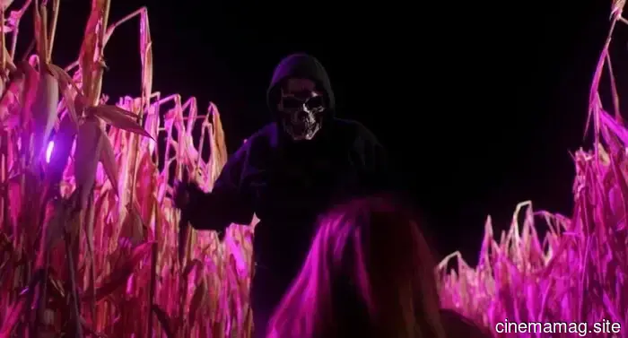 Secrets from a small town become lethal in the trailer for the slasher film Happy Halloween.
Uncork’d Entertainment has unveiled a trailer, poster, and images for the slasher film Happy Halloween, directed and written by Brittney Greer. Emma Reinagel plays Hadley, a teenager attempting to rebuild her life...
Secrets from a small town become lethal in the trailer for the slasher film Happy Halloween.
Uncork’d Entertainment has unveiled a trailer, poster, and images for the slasher film Happy Halloween, directed and written by Brittney Greer. Emma Reinagel plays Hadley, a teenager attempting to rebuild her life...
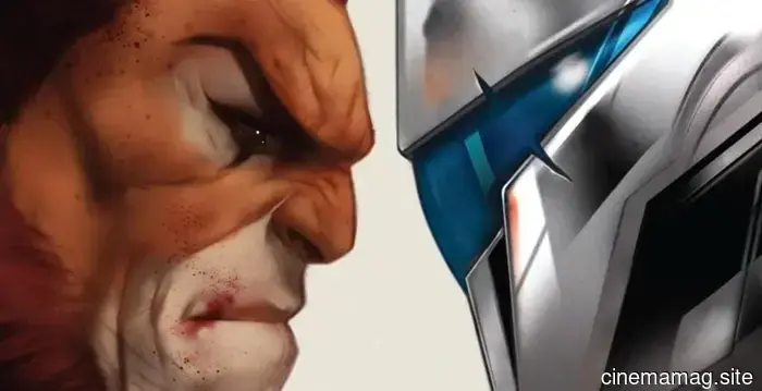
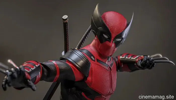 Wolverinepool is added to Hot Toys' collection of Deadpool and Wolverine with a sixth scale figure.
Hot Toys has officially revealed its sixth scale Wolverinepool figure, which draws inspiration from previously unused concept art for the upcoming 2024 Marvel Studios film Deadpool & Wolverine. This figure is limited to 2000 pieces…
Wolverinepool is added to Hot Toys' collection of Deadpool and Wolverine with a sixth scale figure.
Hot Toys has officially revealed its sixth scale Wolverinepool figure, which draws inspiration from previously unused concept art for the upcoming 2024 Marvel Studios film Deadpool & Wolverine. This figure is limited to 2000 pieces…
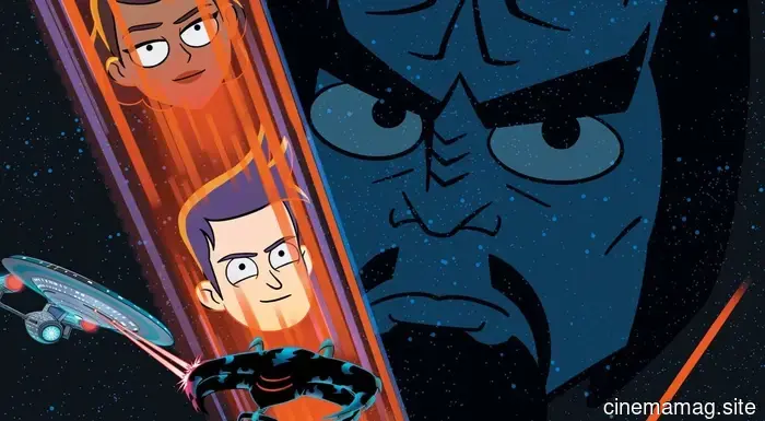 Comic Book Sneak Peek – Star Trek: Lower Decks #18
IDW Publishing is set to release Star Trek: Lower Decks #18 on Wednesday, and you can check out a sneak preview of the issue below with the official teaser... This exciting finale addresses the mystery of th…
Comic Book Sneak Peek – Star Trek: Lower Decks #18
IDW Publishing is set to release Star Trek: Lower Decks #18 on Wednesday, and you can check out a sneak preview of the issue below with the official teaser... This exciting finale addresses the mystery of th…
Posterized April 2026: Blue Heron, The Christophers, Exit 8, and More
Is spring the new summer? It seems to be a significant month for films. There's Mario, Michael Jackson, and Pattison/Zendaya 1.0. Universal is giving us yet another new Mummy in a sense of déjà vu. Additionally, Faces of Death (April 10) has potential appeal for a new generation that might have caught whispers of urban legends from their parents. (I nearly wrote