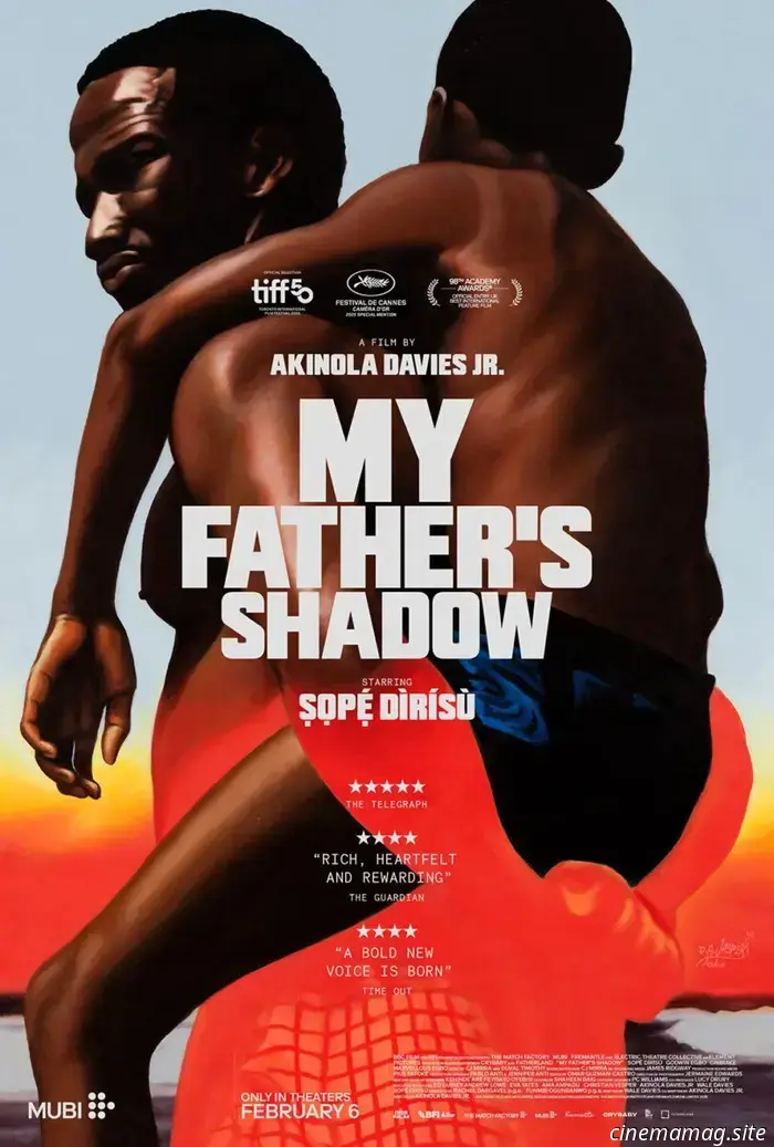
Posters for February 2026: Wuthering Heights, Pillion, My Father’s Shadow, and more.
The new year is underway, and January's sluggishness is making way for a February filled with Oscar-qualifying films receiving limited and/or platform releases across the country. There are also some wide releases, such as another Scream sequel (February 27) and an additional The Strangers prequel sequel (February 6), but these merely serve as counterprogramming to the Oscar nominee re-releases and international contenders since horror films tend to perform well throughout the year.
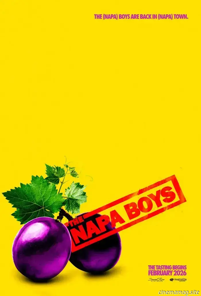
So, look beyond the flashy visuals featuring scary masks and animated basketball-playing animals to find films with producers eager to invest in art that reflects their quality. Sometimes, this results in a sophisticated piece of creative work, like the last trio showcased below. Other times, it yields a skillfully crafted yet risqué joke, such as Mark McGillivray’s The Napa Boys (February 27).
Whatever is effective.
What a character
One common approach for wide exposure is the character sheet. By creating a template and replacing the actors in a generally dull scene of flying embers, or as demonstrated here, by showcasing a genuinely appealing sense of composition and creativity.
Are the posters for Crime 101 (February 13) particularly innovative in their design? No. The text remains static while the actors’ names and images switch between cast members. The only visual elements that persist are the fold creases on the left side (top and bottom corners), and the cropping technique also serves a conceptual purpose.
The actors are positioned in the top half of the frame, with everything above their noses cropped out. This creates a heightened sense of drama and urgency. There’s also action, as Chris Hemsworth exits his vehicle and Mark Ruffalo directs orders into an intercom. It feels gritty and impulsive, effectively setting a scene.
You simply don’t experience that in the full cast versions by Empire Design. The collage boxes come off as nothing more than cut and paste. The other two attempts at creating a vibe with a masked silhouette against a skyline and a bridge for floating heads do provide some motion, particularly with the swooping curve. Working with one actor at a time can sometimes provide greater creative freedom.
(On a side note, isn’t it surprising that none of these feature the Amazon MGM logo? They’ve all been crafted as teasers without a full credit block, which seems more like an oversight than a deliberate choice.)
A similar observation applies to Hunting Jessica Brok (limited, February 13). The Robot Eye’s full sheets do a competent job of masking the characters and combining them into the customary totem of importance and/or billing, but they lack the flexibility that would allow them to stand out compared to their individual counterparts.
This is the moment where designers can truly excel. Utilize edge-to-edge title text. Eliminate the counters from the letters to create larger spaces for transforming them into windows. Allow each actor’s face to emerge through these openings to ensure their expressions remain visible. It’s a bold, staccato proclamation as each word demands our attention, leading us to perceive the person behind it.
This technique also applies to films without large casts. If Pillion (limited, February 6; expanding, February 20) wants to spotlight only two leads, why not equip each with a character sheet to gain extra visibility on the theater wall?
One might argue it’s not worth the effort, but what if the duo collaborates seamlessly? What if Eddie Loughran and Empire Design purposely select images that complement one another in their partnership? It’s not just the sexualized, drenched close-ups of these men and the sleek lowercase title design at work. It’s also that one holds a lock, while the other possesses a key.
Moreover, the design firm builds on these two to produce a third that employs the exact same typography (though merged into one) and introduces a new reference point for the men as big dog and little dog. This intentional visual dialogue runs throughout the entire campaign.
And if there’s not enough room to display all three? Eileen Steinbach’s German-language poster succinctly conveys the same message with one minimalist depiction of a chain locked into a heart.
What a tease
There are also excellent examples of teaser posters this month. Take a look at GrandSon’s How to Make a Killing (February 20), which creatively twists the Polo Ralph Lauren logo into a depiction of the Grim Reaper on horseback wielding a sickle. It perfectly encapsulates Glen Powell portraying Patrick Bateman, with Ivy League arrogance smiling as he slits your throat. It’s simple and clean. They even added a pun in the tagline.
Is that what the film revolves around? I honestly cannot confirm. However, examining the film’s additional posters suggests it may be. Both GrandSon’s family tree and Empire Design’s jail cell gate (both featuring photography by Gavin Bond) make the Bateman references clear. The only question remains whether the bolder font of the former or the sleeker design of
Other articles
 Sundance Review: Wicker Boldly Reflects on the Self-Destructive Dangers of Envy
The envy of discontented couples. The spitefulness of cruel girls. The irritation of insecure partners. It's a story as old as time, vividly reimagined by writer-directors Eleanor Wilson and Alex Huston Fischer in Wicker, an audacious and enchanting film about an outcast woman, her husband made of wood, and the community that crumbles due to their love. This
Sundance Review: Wicker Boldly Reflects on the Self-Destructive Dangers of Envy
The envy of discontented couples. The spitefulness of cruel girls. The irritation of insecure partners. It's a story as old as time, vividly reimagined by writer-directors Eleanor Wilson and Alex Huston Fischer in Wicker, an audacious and enchanting film about an outcast woman, her husband made of wood, and the community that crumbles due to their love. This
 Rotterdam Review: In Tokyo Taxi, Yoji Yamada Navigates Familiar Routes.
Forget about misunderstood hacks and generational talents. Nothing compares to a reliable studio player (with a solid 3- or 4-star batting average) who operates beneath the global radar for much of their career. By the time Neil Armstrong set foot on the moon, Yoji Yamada was nearing middle age and had already completed his 16th feature film, but it
Rotterdam Review: In Tokyo Taxi, Yoji Yamada Navigates Familiar Routes.
Forget about misunderstood hacks and generational talents. Nothing compares to a reliable studio player (with a solid 3- or 4-star batting average) who operates beneath the global radar for much of their career. By the time Neil Armstrong set foot on the moon, Yoji Yamada was nearing middle age and had already completed his 16th feature film, but it
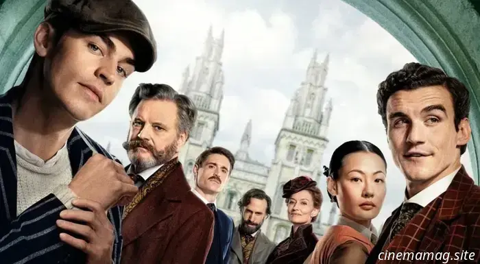 Prime Video has released a new trailer for Guy Ritchie's Young Sherlock.
With only a month remaining until the premiere of Young Sherlock on Prime Video, a poster and trailer have been unveiled for Guy Ritchie's action mystery series. This series is inspired by Andrew Lane's Young Sherlock...
Prime Video has released a new trailer for Guy Ritchie's Young Sherlock.
With only a month remaining until the premiere of Young Sherlock on Prime Video, a poster and trailer have been unveiled for Guy Ritchie's action mystery series. This series is inspired by Andrew Lane's Young Sherlock...
 All 11 Star Wars Films Ranked from Least to Most Favorable
Here is a ranking of all 11 Star Wars films from worst to best as we anticipate the release of the 12th film, The Mandalorian & Grogu, this summer.
All 11 Star Wars Films Ranked from Least to Most Favorable
Here is a ranking of all 11 Star Wars films from worst to best as we anticipate the release of the 12th film, The Mandalorian & Grogu, this summer.
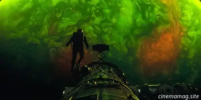 The teaser for Project Hail Mary gives a sneak peek at the Super Bowl spot airing on Sunday.
In anticipation of this Sunday’s Super Bowl advertisement and the upcoming release of the final trailer, Amazon MGM Studios has unveiled an impressive teaser for Phil Lord & Christopher Miller’s Project Hail…
NYC Weekend Preview: Nadja, Seoul After Dark, Tenement Tales & More
NYC Weekend Watch is our weekly roundup of repertory events. BAM will showcase Michael Almereyda's vampire movie Nadja, which is making its long-awaited debut in a 4K restoration that screens daily. Check out an exclusive clip below: Museum of Modern Art's Seoul After Dark focuses on underappreciated Korean films, featuring works by Bong Joon-ho and Im Kwon-taek as well. Film Forum presents movies by Coppola, Scorsese, and King.
The teaser for Project Hail Mary gives a sneak peek at the Super Bowl spot airing on Sunday.
In anticipation of this Sunday’s Super Bowl advertisement and the upcoming release of the final trailer, Amazon MGM Studios has unveiled an impressive teaser for Phil Lord & Christopher Miller’s Project Hail…
NYC Weekend Preview: Nadja, Seoul After Dark, Tenement Tales & More
NYC Weekend Watch is our weekly roundup of repertory events. BAM will showcase Michael Almereyda's vampire movie Nadja, which is making its long-awaited debut in a 4K restoration that screens daily. Check out an exclusive clip below: Museum of Modern Art's Seoul After Dark focuses on underappreciated Korean films, featuring works by Bong Joon-ho and Im Kwon-taek as well. Film Forum presents movies by Coppola, Scorsese, and King.
Posters for February 2026: Wuthering Heights, Pillion, My Father’s Shadow, and more.
The new year is underway, as the January lull gives way to a February filled with Oscar-qualifying films that are getting their limited and/or platform releases across the country. While there are also some wide releases, such as a new Scream sequel (February 27) and another prequel sequel to The Strangers (February 6), these serve primarily as counterprogramming.